I am a traditional scrapbooker, but digital does have its advantages. I am also an iPhone user and the apps available cover a wide range of interests and uses. There aren't too many for scrapbooking but I'd like to mention this one: Bazzill Basics Paper. Most scrapbookers and cardmakers know the name. They are most known for their wide range of cardstock colors and textures, but they also offer color coordinated embellishments. But how often do you find it difficult to pick out the perfect cardstock that matches the colors in your subject photos?
Well, now there's an app for that... Bazzill Basics Paper's app. Not only does it give you a choice of looking up cardstock by name, color, or color family but it has two extra nice features: matchmaker and colormatch. Matchmaker is a list of popular companys, like Fancy Pants or Crate Paper, and their collections with a list of color matched Bazzill Basic cardstock. No more guessing what color matches... just look it up. Easy!
Now to make it even easier, there's colormatch. This is my favorite feature of the app since I start with the photo(s) and build my layout from there. But how to pick out the perfect color palette for the subject can, at times, be challenging. Colormatch makes it a little easier. Just use any photo on your iPhone (one you took or one you saved to your iPhone) and start colormatch.
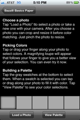
This is the starting screen where you select your photo to create the perfect palette of colors.

Once you select your subject photo, you are ready to begin. Notice the five gray boxes at the bottom of the photo.
The first gray box is usually selected. To pick a color, tap anywhere on the photo and it will pick up the color. The selector is not small so a small spot of color will not pick up well. You can always resize the photo to get larger areas of color. Once you have the first color you want, tap the next gray box to select the next color. Continue until you have five colors perfectly matched to your photo. Here's an example:
If you are happy with your selected palette, tap "Palette" to see the colors, the Bazzill Basic colorname, the RGB color numbers and the CMYK color numbers (great for digital scrapbookers).
You can still go back to your photo and change it if you aren't perfectly happy. Once you are happy with the selection, you can save your palette. The app will keep a list of your saved palettes that you can view at any time. Just name the palette in a way that reminds you of the photo you used.
So, to review:
| Negatives: |
| * The color selector is not small so small spots of color are hard to pick up. |
| * The photo used to create a palette is not saved with the palette. |
| Positives: |
| *A list of popular patterned paper brands and their collections colormatched with coordinating Bazzill Basics cardstock. |
| *Create a color palette specific to a photo and save it to view at any time. |


Comments
Post a Comment